How to use this guide
All of The Seam’s brand elements and features are proprietary. If you opt to use any logos, designs, trademarks and/or other brand elements, you acknowledge your acceptance of the terms in the brand guidelines.
For more information, please contact:
Beth Wilson
Director of Marketing and Public Relations
beth.wilson@theseam.com
(901) 374-0374
Logos
The Seam logo is the primary means of identifying the organization, and should never be manipulated or recreated. This is essential to maintain a consistent presentation of the brand identity.
Horizontal Logo Minimum Size:
95 pixels wide 1.3 inches wide





Anniversary Logos
The Seam Anniversary logo should be used during the year of 2020.
Horizontal Anniversary Logo Minimum Size:
127 pixels wide 1.7 inches wide






Logomark
Logomark Minimum Size:
16 pixels wide 0.3 Inches wide





Clearspace
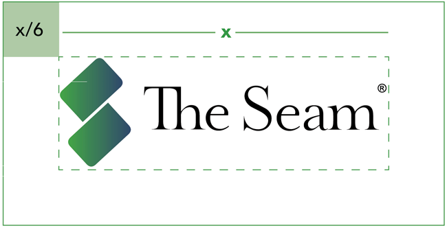
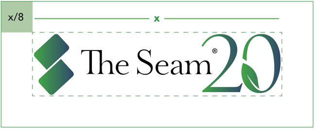
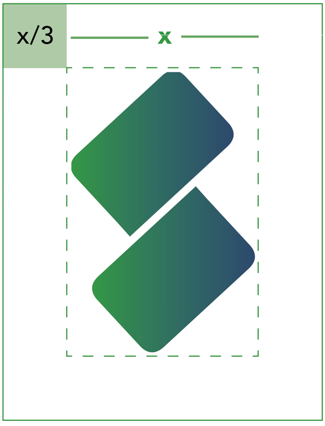
The Seam logo should always be surrounded by a minimum area of space. The horizontal anniversary logo should maintain a clearspace margin equal to the width divided by eight. The horizontal logo should maintain a clearspace margin equal to the width divided by six. The logomark should maintain a clearspace equal to the width divided by three.
Brand Colors
The Seam corporate color palette consists of two colors and one gradient. This include four primary colors and four secondary colors.
Color references are provided for the Pantone color system, in CMYK for four color printing, in RGB for use on screen, and hexidecimal values for use online.
Consistent use of color will help build strong brand recognition.
Primary Colors

Pantone 149-7 U
CMYK 80 16 100 3
RGB 51 152 70
HEX #339846

Pantone 100-8 U
CMYK 100 98 15 18
RGB 40 41 113
HEX #282971

Pantone 149-7 U to
103-15 U
CMYK 80 16 100 3 to
90 73 35 20
RGB 51 152 70 to
46 73 108
HEX #339846 to
2E496C
Secondary Colors

Pantone 103-15 U
CMYK 90 73 35 20
RGB 46 73 108
HEX #2E496C

Pantone 179-2 U
CMYK 7 5 6 0
RGB 233 233 233
HEX #E9E9E9

Pantone 99-1 U
CMYK 4 2 2 0
RGB 243 243 243
HEX #F3F3F3

Pantone White U
CMYK 0 0 0 0
RGB 255 255 255
HEX #FFFFFF

Pantone Black U
CMYK 40 30 30 100
RGB 0 0 0
HEX #000000
Typography
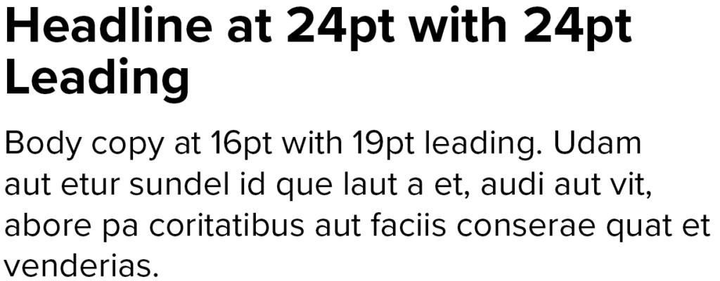
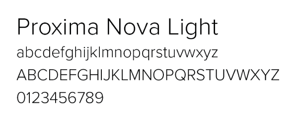
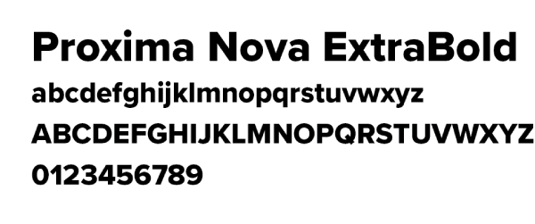
Primary Typeface: Headlines
Proxima Nova is the typeface used for headlines. After this, use platform specific fonts where needed.
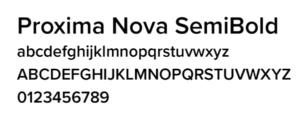

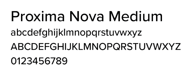
Primary Typeface: Body Copy
Proxima Nova is the typeface used for body copy. After this, use platform specific fonts where needed.



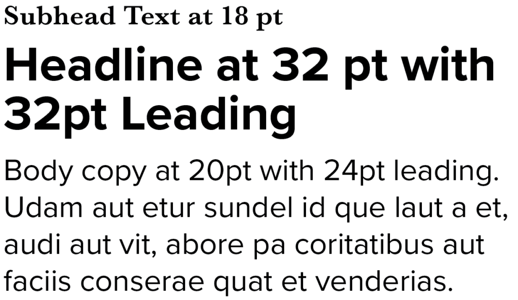
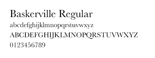
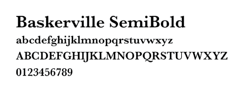
Secondary Typeface
Baskerville is the typeface used for by-lines, pull quotes, captions, and subheads. After this, use platform specific fonts where needed.
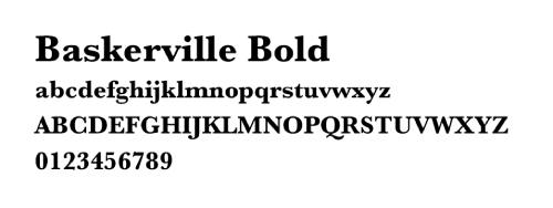
Typography Examples
